
Thursday, 22 February 2018

Wednesday, 21 February 2018
Additional Music Video Feedback
We played our music video to the class and got this following information:
- There are too many shots on the stamping of the playstation, take some of them out and replace with different location
- The phone call scene- slightly blury and too long
- Cut different scenes between the street, as it is too long otherwise and will fill in the gaps.
what we need to do to address this is the following:
- Take out shots of the trampling on the playstation and replace them with different shots from different locations
- Shorten the phone call and use premier pro to make it less blurry
- Look at different editing techniques to make the street sequence more entertaining as this will mean that we not need to film any additional sequences as we have deleted all our footage. If we look at using after effects, we can therefore make our music video more entertaining and professional and engaging to the audience
Second Draft of the Website
After receiving Feedback from our first draft of our Artists website, I changed multiple things including:


- The colour scheme: Our feedback told us that we should change the colour scheme of our website. From this and our other website research, I changed the colour scheme to Black, in order to make the pictures and information stand out more. I also, made the tabs the same shade of pink as the Digpak in order to make them more connected
- As a group, we researched Louisa Johnson's website and took inspiration from it: We took the same picture that was on our first draft of our homepage and used photoshop to add a Vignette. This was a good idea as it adds effect the image and also adds more focus onto Dani, this is important to make sure that the focus is on Dani as We are trying to sell her star image, as well as her music
- More interaction: I added more tabs in order to make the website more interactive for Dani's audience. I created more tabs, including, 'ABOUT' 'TOUR' 'MUSIC' and 'CONTACT'. This can allow fans to find out more about their favourite artist


Feedback and What we need to change:
- Edit and Change the colour of the home page picture in order to make it more connected to the Digipak and Music Video
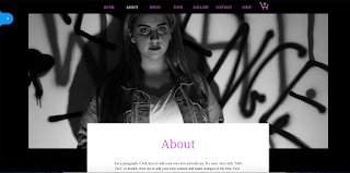
- Our feedback did not like the picture of Dani on the 'ABOUT' page, we will therefore change this
- We need to add more merchandise
First Draft of the Website
To create a Website for our Artist, I decided to use the online website creator - Wix. This website was easily accessible and simple to use. I created a first draft in order to explore all the different tools and options before creating the final draft.
How it was Created:
To create the home page for our website, i uploaded a picture of our artist Dani, from which we took on our photoshoot for our digipak, I chose this picture as it was bold and it shows clearly what type of artist she is. I then went on to the 'background' tool and changed the colour to blue in order to match the picture and then made her name the same colour and bold to stand out. It was important for the name to stand out as Dani is a young and up and coming artist and so therefore it is important for her to sell herself as well as the music. In order to make her name stand out I Highlighted the blue with black due to the fact that in our website research, a lot of the artists we looked at (including Lily Allen and Beyonce) all had an element of black on their websites home pages. Artists, usually do this in order to make their name or their music stand out. Additionally, i created a 'Gallery' tab, where i placed many pictures of Dani. I did this by uploading more pictures from our music video filming and Digipak Photoshoot. This was a good idea, as it will allow Dani to sell herself as an artist, and will allow her fans to connect with her personally. Lastly, I added a 'SHOP' tab as it is important for an Artist to sell merchandise as that is one of the main ways that a artists will make money through revenue. For the Merchandise I went onto a free, online personalised clothing website and created a few pieces of clothing with Dani's name and picture on them. This was quick and easy to make and will be a great way for Dani to additionally sell herself and her music.


Feedback and what we need to change:
After receiving feedback from people in my Media class, I learnt this about my Artists Website:
- They really liked the Home page Picture, so we should keep that as our main front page, however, they did not like the blue colour
- We should change the colour scheme to make it more similar to our music video and Digipak.
- We need to add more tabs about the Music and Tour dates
Subscribe to:
Comments (Atom)