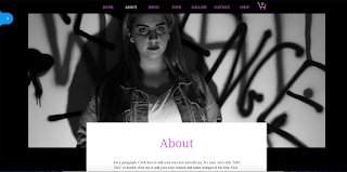
- The colour scheme: Our feedback told us that we should change the colour scheme of our website. From this and our other website research, I changed the colour scheme to Black, in order to make the pictures and information stand out more. I also, made the tabs the same shade of pink as the Digpak in order to make them more connected
- As a group, we researched Louisa Johnson's website and took inspiration from it: We took the same picture that was on our first draft of our homepage and used photoshop to add a Vignette. This was a good idea as it adds effect the image and also adds more focus onto Dani, this is important to make sure that the focus is on Dani as We are trying to sell her star image, as well as her music
- More interaction: I added more tabs in order to make the website more interactive for Dani's audience. I created more tabs, including, 'ABOUT' 'TOUR' 'MUSIC' and 'CONTACT'. This can allow fans to find out more about their favourite artist
Feedback and What we need to change:
- Edit and Change the colour of the home page picture in order to make it more connected to the Digipak and Music Video
- Our feedback did not like the picture of Dani on the 'ABOUT' page, we will therefore change this
- We need to add more merchandise


No comments:
Post a Comment