- Editing the music video for our artist had strengths and weaknesses and also challenges.
- Overall, we believe that as a result of this process we have been able to create a successful music video.
- We first organised folders and labelled these to what location or camera angle. This made it easier to select which shots we wanted use when putting it all in order on Adobe Premier Pro. Our animatic story board was a guidance to know which location or which shot we needed to select.
- We also put all out shots on an external hard drive incase we would loose our footage on the original device.

- However, once we put the music video in order, we noticed that some of the shots needed replacing due to her lip syncing being out of sync, or bad lighting. This meant we had to review all the shots we took to see how we could replace the gaps. This is an example of what we had to take out due to the lighting and the artist not being in the camera frame. We thought this would happen e.g. some shots not coming out as expected so on our filming days we recorded multiple shots of the same action.
- In the jump cut we used the video transission ‘dip to white’ to make a cereal flash when the song cut to beat to show the passing of tine.


- We wanted to exaggerate the lyric “WHAT” so we got the footage over another Clip of footage by changing the levels of opacity. This enabled it to pop out at the viewer and make it more exciting to watch, which was necessary to have at the beginning to show our skilful editing techniques.

- In the flashback scene we originally had a zoom into the photo of the couple, which cut to the location where they took the photo in the past.


- However, the cut was not smooth and didn't look profession so with the use of After Effects we replaced the cut with live phone screen with them taking the photo, which made it look more realistic.
- This made it smoother to transmission into the over shoulder shot of them taking the photo, which we later colour corrected into warmer tones to reflect the better times in their relationship.
- Our original shot of breaking the playstation was too simplistic, so we cut the shot and duplicated it and reversed one of them so that it had the effect of bouncing back and fourth.


- We sped up a lot of footage to make it more enticing and less boring. For example, the time lapse of the the car and grafting the walls. We did this by changing the percentage of the speed on Adobe Premier Pro
- We added interesting transitions such as ‘Additive Dissolve’ to show two an effective way of her being rebellious but then also transitions to singing which shows her star image, as well as her rebellious side


- In the studio footage the backdrop was a green screen, which gave us the advantage to choose any background we wanted. In adobe After Effects we inserted a graffiti background, which was relatable to our narrative. The colours were conventional due to the genre of the music video being pop.


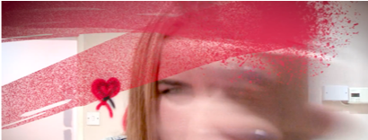
- When planning we told our artist to pretend she was spaying the camera as in editing we would insert a spray paint effect to look as if she was spraying on the camera. This had to be done through editing as she could not actually spray the camera.
- The phone call scene was necessary to have a split screen to clearly show their conversation
- We then added a movement effect within the split screen to show she had power, which matched with the lyrics (lyrics matching the visuals)
- The movement of the split screen kept going back and fourth until the conversation was over and the ‘ex’ got pushed out the screen


- We emphasised her wink as a way of addressing the audience and to show her rebellious side of her getting all the revenge on her ex. The smile shows she is sadistic.
- To do the highlighted wink we added beam of light on after effects and adjusted the scale of it to look as if it was coming from her eye.

Sound Effects
- When it was the flashback, we wanted to make sure it was clear that they were taking to photograph to make it realistic as possible. So we inserted a shutter sound effect. As the photo shows the sound was at a high level of volume to over power the song at this moment in time. This made the audience more attached as to what was going on and felt part of their previous relationship.

- The next sound effect we added was a ‘ding’ to when she winked. We did this because the song was coming to an end and faded out with no lyrics.
- We wanted it to finish off with a conventional pop song so the sound made it more memorable and more attention grabbing to the viewer.
How we added the illusion she was spray painting the camera?

- We got assets off Google, and we made sure they were transparent
- We exported the clip on to Adobe After Effects, where we wanted to add this illusion
- We inserted a marker on the Clip where we wanted the spray paint to start
- We imported our assets filled which had the brain brush strokes
- We used the eye dropped tool to select the same red used in the spray paint on the wall to make it realistic and consistent.
- Next, we went to ‘effects and presets’ and typed in ‘fill’ with our brush layer selected
- We then filled the brush strokes with this selected red

- The texture of the paint strokes were too thick and could not see our artist behind it, so we changed the opacity to 40%
- After inserting the first brush stroke and changing the opacity we wanted the follow the movement of the can
- We positioned this in time with her movements and then key framed it which kept it in place, whilst pressing the key ‘R’ followed the movement of the can
- We added ‘motion blur’ to make it even more realistic
- To make It look even more like spray paint we understood that if she sprays the same place twice, it will appear more bold and gave a ‘splash’ effect rather than a brush stroke which is what we wanted
- So we went back to google and found a splash that was more similar to our paint strokes.
- We repeated the same steps until our artist finished spraying the screen
- We used different brush strokes to make it look more consistent and effective
- We did this by masking the images and set it to subtract
- We then went to the mask bar and pressed key frame, then took the mask off.
- We feathered the mask to blend in with the background.


How we did the camera flash back:
- We took the original footage and put it into after effects.
- We then got an iphone front camera image
- We put the footage inside of the iPhone to make it look like they were taking the photo.
- We then added a white flash to make it look like they were taking the photo
- This led to the flashback.

How we did a graffiti background on the green screen?
- We inserted all the studio clips which had a green screen and pasted into after effects.
- Duplicated it incase we needed the original
- "Mask Tool” and set in onto an ellipse mask and dragged it to fit
- We then brought up the mask properties and pressed key frame mask path
- We then used the arrow tool on the keyboard to follow her movement
- Then we brought in the background and re imported (copy and paste) to the new comp
- We copy and pasted the effects used in the other images so that they matched.
- To change the vantage point, we changed to 3D and change rotation
- Then we selected the scale properties to size it up in order to match the screen




