Ariana Grande - Yours truly:
- The bright vibrant colours are used to connote the idea that she is synthetic. The Pink is used to attract a young mainstream pop audience of girls.
- Flowers are used to reflect the synthetic nature of the artist as it draws attention to her innocence as an artist.
- Her title of the album is the same size and font, showing that the album is not selling the music but also selling herself as an artist. This also shows that she is an established name as she is a big mainstream artist
- High - key lighting is used as a spot light around the singer, which sells herself and her star image
- The artist is looking directly at the camera, highlighting that she is selling her looks rather than the actual music itself.
- Her stance represents her to be innocent and young which is also her intended target audience.
Organic CD covers:
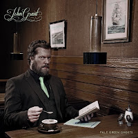
John Grant - Pale green ghosts:
- The dark colours are used to connote the idea that he is an organic artist. The Brown is used to attract an older audience of men
- The props used containing items such as coffee and a book which again reflects the organic nature of the artist. The book shows that he is literate and well educated.
- The artist is looking directly at the camera, however, his facial expressions are serious. This is used to sell himself as a serious artist which cares more about the music than his star image.
- The font of the music is different to the font of the name of the artist, which therefore differentiates the music from the artist. The style of hand writing is old fashioned and mature, representing that his music is directed at an older audience
- The camera shot used, breaks the rule of thirds. This is done intentionally to make him blend in with his surroundings
- John Grant is wearing smart clothing, in a full suit, this differentiates him from synthetic singers as he is not wearing mainstream clothes


No comments:
Post a Comment